August 17, 2022
Four Critical Elements for a High Converting Landing Page
Key Takeaways
- User experience greatly impacts conversion rates: 89% of consumers switched to a competitor’s website because of a bad user experience
- Use a clear and concise value proposition, above the fold, could increase the conversion rate on your landing page by 35%
- Adding a simple and direct call to action could increase your landing page’s conversion rate by 43%
- Avoiding the use of different call to actions that compete for your visitor’s attention could increase your landing page’s conversion rate by 82%
- Adding a verified logo to establish trust can increase the conversion rate on your landing page by 42%
- It is critical to provide a fast user experience because 79% of web shoppers who have trouble with website performance say they won’t return to the site to buy again
- Creating a fast checkout process could increase your conversion rates by 21.8%
If your website isn’t converting visitors into customers or clients, then it is time to redesign your website. Visitors spend only six to ten seconds visiting a website and 89% of consumers switched to a competitor’s website as a result of a bad user experience. Therefore, it is critical to make certain that your website is able to engage visitors, earn their trust, and convert them. Additionally, there are about 22 million websites in existence in 2022, making the competition for attention a lot tougher. This emphasizes the importance of investing in designing a high converting landing page. In fact, studies show that businesses that are “design-driven” are 69% more likely than their peers to exceed their business goals.
What is a landing page?
A landing page is a standalone web page that visitors “land” on and is designed with a single focus or goal; usually the goal is for the visitor to execute a call to action (CTA).
How to Create a High Converting Landing Page
There are many ways to increase conversion rates on a landing page. Based on the latest statistics, here are the four critical elements you need for a high converting landing page:
1. A Clear and Concise Value Proposition Above the Fold
Since you only have seconds to make an impression, it is important to be able to succinctly describe who your target audience is and what value you are providing to them. Ideally, you would place this concise value proposition above the fold (otherwise known as the part of the landing page shown before scrolling).
A company called Device Magic tested two versions of their landing page: one landing page had lots of information, multiple bullet points and an introductory video (see Figure 1, left side) and the other landing page was kept simple: a value proposition statement with image sliders.
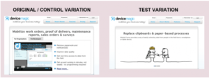
Figure 1. Adding a Clear Concise Value Proposition to Increase Conversions
The simple landing page focusing on the value proposition (shown on the right side in Figure 1) led to a 35% increase in click throughs and sign up.
2. A Simple and Direct Call to Action & Avoid Competing Call to Actions
70% of small businesses do not have a call to action on their website homepage; thereby missing the opportunity to convert their visitors entirely. A few things to keep in mind when you are creating a call to action:
Avoid using different call to actions that compete with each other
The Sims 3 creators did some testing to see how their call to action strategies impacted the conversion rate on their website. They tested the effectiveness of having four different calls to action (with various offers) versus using one call to action throughout the landing page. They saw a 43% increase in conversion when they had one call to action rather than multiple, different calls to actions. Visitors found the competing call to actions with alternating offers challenging to understand, therefore did not click on them. The key takeaway is: use one call to action instead of multiple different call to actions that would confuse your visitors.
Use a simple and direct call to action:
Friendbuy performed some testing to see which call to action would perform better: a “test it out” call to action versus a “see demo” button. They found that having a concise, concrete call to action (“see demo”) increased their conversion rates by 82%.
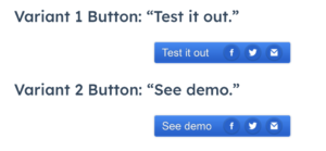
Figure 2. Example of Adding a Simple and Direct Call to Action
The key takeaway lesson is that if you have a complicated call-to-action button that is indirect, the less likely it is that visitors will click on it.
3. Establish Trust with Your Audience
Your brand needs to earn the trust of your website visitors in order to convert. Here are a few ways you can earn trust on your website, by adding:
- Recognizable awards, logos
- Reviews, ratings, or customer feedback
- Testimonials
- Social proof: you can share how many likes and followers you have on social media
- PR or news coverage
- Security badges (e.g. secure checkout)
- Brand Story
For example, Blue Fountain Media found adding the VeriSign logo to their page increased conversion by 42% and sign-up-form entries by 81%.
4. Provide a Fast User Experience
Case studies show that a slow loading website and a long checkout process negatively affect the user experience and translates to a decrease in conversion rates. Here are two ways you can improve the visitor’s user experience:
Decrease Your Landing Page’s Loading Time
Nearly 70% of consumers admit that page speed impacts their willingness to buy from an online retailer and 79% of web shoppers who have trouble with website performance say they won’t return to the site to buy again.
So just how fast should your landing page loading time be? Well, according to the research done in 2019, a 0-4 second load time produced the best conversion rates.
Provide a Fast Way to Execute the Call to Action
If you are looking to have your visitors subscribe or checkout, design your call to action process quick and simple. The Vancouver Olympic 2010 Store tested two versions of their checkout process: one version had four separate pages for the checkout process (sign in / create account, shipping address, billing address, and confirmation) whereas the other version had two pages (checkout page and a confirmation page that also encouraged account creation). The shorter checkout process increased conversions by 21.8%. The lesson here is that when you make it easy and quick for the user to checkout, the higher your conversion will be on your landing page.
Summary of the Four Critical Elements for a High Converting Landing Page
Ultimately the main idea behind building a high converting landing page is: reduce the activation energy required for your visitors to take action. Simply put: if you create a positive user experience that makes it easy and simple for the visitor to trust your brand and to follow through with the call to action, you will increase your conversion rate.
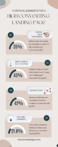
Figure 3. Infographic: Four Critical Elements for High Converting Landing Page
